
How do you build consistency without building a rulebook? As Urban Outfitters expanded across channels, markets, and external partnerships, the absence of a shared visual foundation became increasingly difficult to manage. I led the development of a core branding system designed to create alignment across teams while preserving the flexibility and experimentation central to the brand's identity.
Company
Urban Outfitters
Timeline
2014
—
2021
Role
Associate Creative Director
Overview
For more than 50 years, Urban Outfitters has evolved through experimentation rather than strict brand guidelines. This project focused on defining a shared foundation for a growing global brand without sacrificing the creative freedom that made it distinctive.
Approach
Traditional brand guidelines were never the goal. Instead, I worked with the graphics team to identify the visual elements that consistently appeared across the brand and define a flexible framework around them.
The result was a shared foundation built around typography, hierarchy, and brand principles that could support internal teams, external partners, localization efforts, and future growth without prescribing a single visual outcome.


System
Rather than a fixed set of rules, the system established a center of gravity for the brand, the brand core. It clarified where consistency mattered, where flexibility was encouraged, and how new creative expressions could connect back to a recognizable Urban Outfitters identity.


Selected Outputs
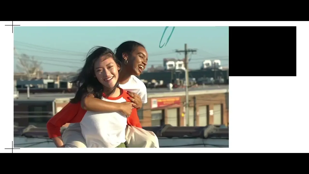
As Associate Creative Director for Digital at Urban Outfitters, I thought of the digital storefront as a distributed system rather than a single destination. Unlike a physical store, it’s made up of fragmented touchpoints: social profiles, acquisition ads, digital out-of-home (like the digital billboard below), each operating independently across external channels or the “top of the funnel.”
In that environment, consistency can’t rely on static layouts alone. Motion becomes a key element connecting the core to some of the more creative elements of the brand.


How do you build consistency without building a rulebook? As Urban Outfitters expanded across channels, markets, and external partnerships, the absence of a shared visual foundation became increasingly difficult to manage. I led the development of a core branding system designed to create alignment across teams while preserving the flexibility and experimentation central to the brand's identity.
Company
Urban Outfitters
Timeline
2014
—
2021
Role
Associate Creative Director
Overview
For more than 50 years, Urban Outfitters has evolved through experimentation rather than strict brand guidelines. This project focused on defining a shared foundation for a growing global brand without sacrificing the creative freedom that made it distinctive.
Approach
Traditional brand guidelines were never the goal. Instead, I worked with the graphics team to identify the visual elements that consistently appeared across the brand and define a flexible framework around them.
The result was a shared foundation built around typography, hierarchy, and brand principles that could support internal teams, external partners, localization efforts, and future growth without prescribing a single visual outcome.
System
Rather than a fixed set of rules, the system established a center of gravity for the brand, the brand core. It clarified where consistency mattered, where flexibility was encouraged, and how new creative expressions could connect back to a recognizable Urban Outfitters identity.
Selected Outputs
As Associate Creative Director for Digital at Urban Outfitters, I thought of the digital storefront as a distributed system rather than a single destination. Unlike a physical store, it’s made up of fragmented touchpoints: social profiles, acquisition ads, digital out-of-home (like the digital billboard below), each operating independently across external channels or the “top of the funnel.”
In that environment, consistency can’t rely on static layouts alone. Motion becomes a key element connecting the core to some of the more creative elements of the brand.